
Introduction
Posters are still one of the fastest ways to communicate a message in a physical space. They work for events, classroom notices, community boards, retail signage, and at-home décor. The challenge is usually getting the information readable from a distance while keeping the layout clean.
Poster design software ranges from template-based editors to full-featured design apps. What separates them in day-to-day use is how they handle sizing (letter vs. tabloid vs. large-format), typography controls, and print-oriented exports like high-quality PDFs.
The steps below focus on decisions and checkpoints—what to do, why it matters, and what to verify—so the poster is readable, correctly sized, and ready to print or share digitally.
Step-by-Step How-To Guide for Using Poster Design Software
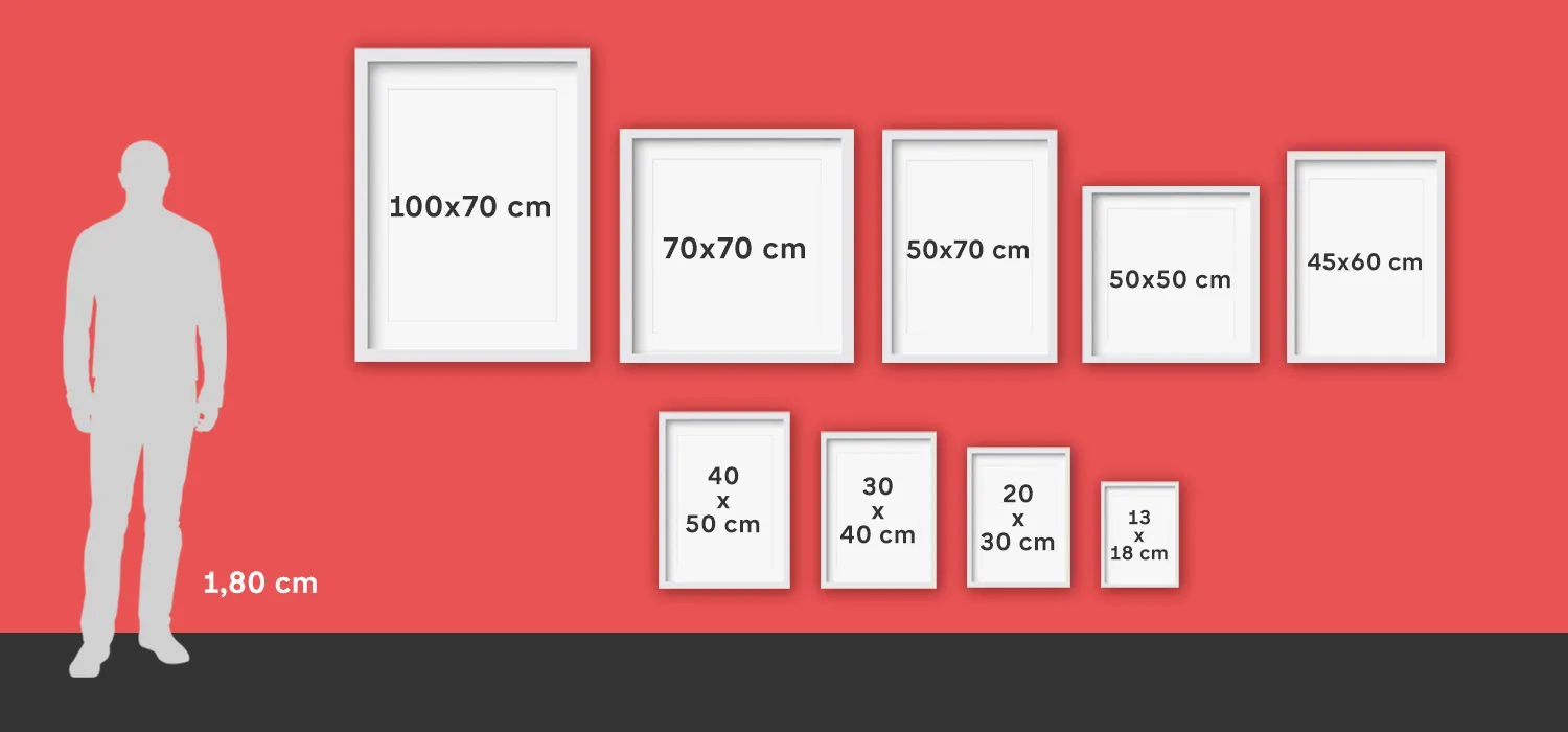
Step 1: Pick a poster size and start from a template
Goal
Set up the right dimensions early so the design doesn’t need to be rebuilt later.
How to do it
- To create a printable poster from Adobe Express, choose a layout that fits the poster’s purpose (event, announcement, informational, decorative).
- Select the target size (for example, letter, tabloid, or a standard large-format size your printer supports).
- Decide whether the poster is intended mainly for print, digital sharing, or both.
- Add only the essential content first: title, key details, and one main visual.
What to watch for
- Changing size late can distort spacing and make text wrap unpredictably.
- Some templates assume lots of text; others assume a single strong image.
- Digital-first posters may need larger type for mobile viewing.
Tool notes
Adobe Express works well for template-led poster layouts; Canva is often used for similar template workflows, while Microsoft PowerPoint is sometimes used internally when teams need a familiar tool for simple posters.
Step 2: Write the poster content in a “distance-first” structure
Goal
Make the message readable and scannable from a few steps away.
How to do it
- Draft a short headline that communicates the main point in a few words.
- Put the most important details in a single block (date, time, location, URL/QR, contact).
- Limit body text and use bullets rather than paragraphs when possible.
- Decide what a viewer must learn in 3 seconds versus what can be optional.
What to watch for
- Too many details can flatten hierarchy and reduce readability.
- Long URLs are hard to read on paper; consider a short link or QR code.
- Small type becomes illegible once printed at distance.
Tool notes
A quick draft in Google Docs or Microsoft Word can help finalize wording before placing it into the poster layout in Adobe Express or another editor.
Step 3: Choose one visual style and keep it consistent
Goal
Avoid a “patched together” look by sticking to a clear visual system.
How to do it
- Choose a simple palette (one dominant color, one accent, and a neutral).
- Limit fonts to one for headings and one for body text (or use one font family with multiple weights).
- Use one image style: photo-based, icon-based, or illustration-based.
- If using a background image, add a subtle overlay behind text to preserve contrast.
What to watch for
- Decorative fonts can reduce clarity for headings at a distance.
- Low-contrast text over photos is one of the most common print failures.
- Too many icons and shapes can create visual noise.
Tool notes
Adobe Express makes it easy to adjust themes quickly; Adobe Illustrator or Affinity Designer can help if the poster needs tight typographic control or custom vector elements.
Step 4: Build the layout using guides and safe margins
Goal
Keep spacing clean and reduce the risk of text being clipped during printing.
How to do it
- Keep a consistent margin around all edges and avoid placing important content near the trim area.
- Align elements to a simple grid (left-aligned blocks are often easier to scan than centered text).
- Group related information (headline, details, callouts) and separate groups with whitespace.
- Check alignment by zooming out until the poster fits comfortably on screen.
What to watch for
- Printers can crop slightly; edge-hugging text is risky.
- Center alignment can look sloppy if lines wrap unevenly.
- Crowded layouts often happen when margins are treated as “empty space to fill.”
Tool notes
Adobe Express supports basic alignment behavior; Figma is commonly used for grid-based layout checks when teams want repeatable spacing rules across multiple posters.
Step 5: Verify image resolution and text legibility at print size
Goal
Prevent blurry images and too-small type once the poster is printed.
How to do it
- Use original images rather than screenshots whenever possible.
- Inspect images at 100% zoom and look for pixelation or compression artifacts.
- Increase type size if the poster is meant to be read from across a room or hallway.
- If using QR codes, keep them large and test scanning from typical viewing distance.
What to watch for
- Social-media-sized images often print soft at poster size.
- Light gray text can disappear on many printers.
- QR codes can fail if they’re too small or placed on a patterned background.
Tool notes
Adobe Express works for quick image placement; Adobe Photoshop or GIMP can help repair low-quality photos before they are brought into the poster layout.
Step 6: Export a print-ready file without unintended scaling
Goal
Produce a final file that prints at the correct size and maintains quality.
How to do it
- Export a high-quality PDF when print is the primary output format.
- Avoid “fit to page” or auto-scaling options if you are printing from a viewer or printer dialog.
- Re-open the exported file and confirm the page size matches the intended poster size.
- Save a second “digital share” export if you need a smaller file for email or messaging.
What to watch for
- PDF exports can substitute fonts if the export does not preserve them well.
- JPEG exports can blur text edges if compression is high.
- Printing from a browser can scale unexpectedly; confirm print settings.
Tool notes
Adobe Express supports common exports; Adobe Acrobat is useful for checking PDF page size and zooming in on small text to confirm it stayed sharp.
Step 7: Proof the final version and manage distribution
Goal
Catch errors before printing and keep versions consistent across print and digital sharing.
How to do it
- Proofread names, dates, times, and addresses, then read the headline once out loud.
- Print a small test (even on letter paper) to check contrast and hierarchy.
- Save an editable master and a locked final export with clear version naming.
- Track where the poster will appear (print locations, internal channels, email attachments).
What to watch for
- Minor text edits can create new line breaks and spacing issues.
- Color and contrast often look different on paper than on a bright screen.
- Multiple versions can circulate if file naming isn’t consistent.
Tool notes
For coordinating approvals and rollout, a project management tool like Trello can help track versions and placement tasks without affecting the design workflow.
Step 8: Organize print logistics and shipping for physical distribution
Goal
Make sure printed posters arrive on time and in usable condition.
How to do it
- Confirm the number of posters needed, sizes, and where they will be delivered.
- Keep a record of the final print file name and the version approved for printing.
- If shipping to multiple locations, standardize addresses and label destinations clearly.
- Store tracking information and delivery confirmations in one shared place.
What to watch for
- Wrong size print orders often come from unclear filenames or missing page-size checks.
- Posters can be damaged if packaging is poor; allow extra time for replacements.
- Multi-location distribution increases the chance of sending outdated versions.
Tool notes
For shipping coordination and tracking across multiple destinations, ShipStation is one example of a tool that complements poster distribution without acting as a design or mockup product.
Common Workflow Variations
- Event poster with minimal text: Use a large headline, one strong image, and a compact details block. Adobe Express or Canva can handle quick template edits, while a test print checks contrast.
- Informational poster (policy, schedule, instructions): Use a grid layout with clear headings and bullets rather than paragraphs. Figma can help enforce consistent spacing, then export a print-ready PDF from the chosen design tool.
- Photo-forward decorative poster: Start with a high-resolution image and keep text minimal. A photo editor like Adobe Photoshop can help with cropping and contrast before layout.
- Multi-poster series: Create one master template and duplicate it for each topic, changing only the headline and details. File naming and version control matter more than visual complexity.
- Digital-first poster for internal sharing: Design for mobile viewing with larger type and a simplified layout, then export a smaller shareable file alongside the print PDF.
Checklists
Before you start checklist
- Confirm where the poster will be used and typical viewing distance
- Choose the final poster size (letter, tabloid, large-format)
- Gather high-resolution images or vector artwork
- Draft headline and essential details (date/time/location/URL/contact)
- Verify rights for photos, icons, and fonts used
- Decide whether a QR code is needed and where it will link
- Plan time for at least one proof review and a test print
- Set a file naming convention for versions and sizes
Pre-export / pre-order checklist
- Page size matches the intended poster size exactly
- Headline is readable at distance and not overly long
- Key details are grouped and easy to scan
- Images look sharp at 100% zoom at the intended print size
- Contrast is strong enough for typical printers
- QR code (if used) is large enough and tested
- Export format fits the goal (PDF for print; smaller file for sharing)
- Final file name includes size and version number
Common Issues and Fixes
- The poster prints with clipped edges or missing text.
Increase margins and keep important text away from the edges. Re-export and confirm the page size is correct. When printing, disable “fit to page” or confirm scaling is set to 100%. - Images look blurry after printing.
The source image is likely too small or heavily compressed. Replace it with a higher-resolution original and avoid screenshots. Re-check at 100% zoom before exporting. - Text is hard to read from a distance.
Increase font size and reduce the amount of text. Strengthen hierarchy by making the headline larger and the details block more compact. Use higher contrast and avoid thin fonts. - Colors look different on paper than on screen.
Screen brightness can make colors look richer than they print. Increase contrast slightly and avoid subtle light grays. A small test print is often the fastest way to catch this. - The layout looks cluttered even though the content is correct.
Reduce the number of font styles and remove non-essential shapes. Add whitespace between content groups. Align blocks to a grid and keep margins consistent. - A QR code won’t scan reliably.
Make it larger and keep it on a plain, high-contrast background. Avoid placing it over photos or patterns. Test scanning from the distance people will actually use.
How To Use Poster Design Software: FAQs
Is it better to start with a template or start with a blank canvas?
Templates reduce setup decisions and help with spacing and hierarchy, which is useful for quick posters. Blank canvases offer more control but require more layout decisions and a clearer plan for structure.
When should a poster be designed for print first versus digital first?
Print-first is safer when posters must be readable from a distance and have strict size requirements. Digital-first works when most viewing will happen on phones or screens, but it often needs larger type and simpler layouts.
What’s the most reliable export format for poster printing?
A high-quality PDF is commonly used because it preserves text edges and consistent sizing. Image formats can work for photo-forward posters, but they require careful attention to resolution and compression.
How much text is too much for a poster?
If the key message cannot be understood in a few seconds, the poster is likely too dense. Move extended details to a QR code or short link and keep the poster focused on headline + essentials.
What’s the easiest way to keep a consistent look across a poster series?
Create one master template with locked fonts, margins, and color rules, then duplicate it for each version. Keeping a consistent file naming system helps prevent printing or sharing the wrong version.